Parkster
In a collaboration with Parkster during a course, we had the opportunity to improve the view for their active ticket in their parking app.
Timeline
5 weeks
Methods
Usability testing
Quantitative & qualitative research
Design solutions


The brief from Parkster
We kicked of the project by getting a brief from Parkster considering the flow of the active ticket. According to their previous research the key issues were:
-
Clear hierarchy is missing
-
Users experience difficulties with finding their active parking ticket
-
Users tend to start a new ticket instead of extending the expiration time of the active ticket
-
The choice of parking zone is not clear to the user
-
It should be quicker to end your parking ticket

Competion analysis
Searching in our own lane first
Looking at similarities and differences I found that there was a few elements that was included in the Parkster app but not in competitors. The biggest difference was the overall impression was that competitors gave a more modern and playful feel.

Pictured: Competitor analysis of the most popular parking apps in Sweden
Survey
Validating the brief
Two of the most common questions at Parkster is how to change your stop time and also how to stop your parking ticket. According to a survey we sent out it seemed like most people knew how to end their parking. What we did find was that most people find it easier to start a new ticket rather than adjusting the time.
The survey was sent out on social media platforms and resulted in 77 participants.

Pictured: Outtakes from our survey made with Google Forms
“Easier just to cancel the ticket and start a new one rather than changing the stop time”
Painpoints
Users have trouble finding their active ticket
Users find it difficult to manouver the slider
Users don't know that they can change the stop time
Low Fidelity prototyping
Sketches
With all the gathered information about the problems users face and what differs competitors from Parkster me and my team used creative methods like Crazy 8 to brainstorm solutions. We then voted to decide what sketches to iterate on.
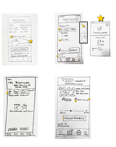

Pictured: Sketches of the active ticket and pop up notifications
Final Screens


Final designs
Finding your active ticket
A common reason users reach out to Parkster's support is that they are unable to locate their active ticket. To help users find it more quickly we added a notification on the lock screen that leads directly to their active ticket. This also reduces the risk of forgetting to end a ticket as users receive constant reminders whenever they pick up their phone.

Notification on lock screen

Notification in app

Notification badge in app
Final designs
Changing your stop time
One of the most prominent issues that came from our survey was that the current slider to change parking time was to difficult to manouver. It was also clear that users found the timespan slider too big, resulting in errors.
According to Parkster many users don't change the stop time at all and prefers to just end the ticket and start a new one.
Because of this we put in quick actions for extending your time quickly.
We did a few iterations where you could subract time quickly as well but this was removed after feedback from users. You could just stop the ticket before the end time runs out.
Before

After

Changed hierarchy of the ticket to improve readability
Quick buttons for adding time
Stop button with final price
Final thoughts
During this project I learned a lot about how I work in a group. I found myself in a position where I took a lot of responsibility to make sure everyone understood the direction we where going in. When telling wasn't enough to explain ideas, showing was the golden key.
I also learned that sketching is a valuable thing to be able to iterate quickly and creatively. It such an easy and affordable tool and you can include everyone in the process, not just the designers.
For further research on this project I would:
-
Conduct on site user tests, to see how the app would fare in a real siuation
-
Find out if there is any analytics of the current app to see if there is a pattern to user ending their tickets rather that changing the stop time